Plotting light curves
LSST light curves can be tricky to plot, so we’ve provided an easy method for a single light curve.
If you’d like to do anything more complicated, like multiple light curves on a single grid, you should consider your own plotting methods.
By default, our methods use the Rubin-recommended palattes, which try to make the plots colorblind-friendly.
Fetch some catalog data
We will use mock DP1 data. This data has been fuzzed to show the general structure of a HATS DP1 catalog, without exposing protected Rubin data.
Note that we have two different light curves on the diaObject table: diaSource and diaObjectForcedSource. You should consider which is more appropriate for your science use case.
[1]:
import lsdb
from lsdb_rubin.plot_light_curve import plot_light_curve
/home/docs/checkouts/readthedocs.org/user_builds/lsdb-rubin/envs/latest/lib/python3.12/site-packages/tqdm/auto.py:21: TqdmWarning: IProgress not found. Please update jupyter and ipywidgets. See https://ipywidgets.readthedocs.io/en/stable/user_install.html
  from .autonotebook import tqdm as notebook_tqdm
[2]:
dia_object = lsdb.open_catalog("../../tests/data/mock_dp1_1000")
dia_object = dia_object.compute()
dia_object
Computing Catalog: 100%|██████████| 1/1 [00:00<00:00, 15.92it/s]
[2]:
| diaObjectId | ra | dec | nDiaSources | radecMjdTai | tract | diaSource | diaObjectForcedSource | |||||||||||||||||||||||||||||||
|---|---|---|---|---|---|---|---|---|---|---|---|---|---|---|---|---|---|---|---|---|---|---|---|---|---|---|---|---|---|---|---|---|---|---|---|---|---|---|
| 164880635168346054 | 4649294066630237364 | 32.454472 | 35.990116 | 24 | 60644.727423 | 531 |
|
|
||||||||||||||||||||||||||||||
| 264907950746260169 | 4624929140954397868 | 10.687421 | 68.569475 | 23 | 60651.313693 | 9273 |
|
|
||||||||||||||||||||||||||||||
| 239647224744314464 | 4649822373104108975 | 77.935377 | 64.983096 | 26 | 60649.146059 | 2392 |
|
|
||||||||||||||||||||||||||||||
| 110828807158025334 | 4658315645230505927 | 54.055610 | 36.212969 | 29 | 60644.832787 | 489 |
|
|
||||||||||||||||||||||||||||||
| 274570109399128569 | 4681220430264917018 | 46.916148 | 77.036664 | 26 | 60638.188747 | 5329 |
|
|
||||||||||||||||||||||||||||||
| ... | ... | ... | ... | ... | ... | ... |
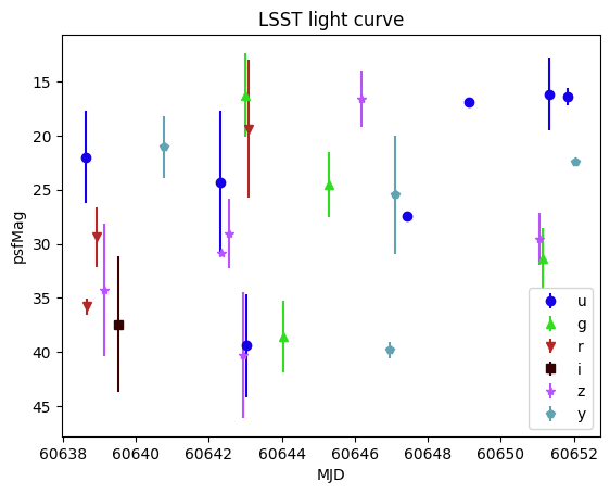
Basic usage
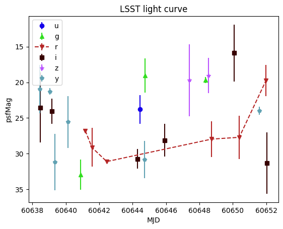
You MUST provide a single light curve as the first argument. This is the entire contents of the lightcurve nested data frame.
This is the only required argument, however, and we will use the psfMag column by default.
[3]:
plot_light_curve(dia_object.iloc[0]["diaObjectForcedSource"])
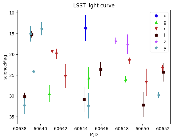
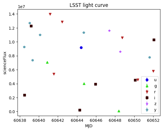
Using a different brightness
You can use either a magnitude or flux column. Straight from the Rubin Butler, you will only have flux, but the HATS pipeline adds magnitudes (and magnitude errors) from flux (and flux error) columns.
If you set a flux column, the y-axis will be un-inverted.
[4]:
plot_light_curve(dia_object.iloc[0]["diaSource"], mag_field="scienceMag")
[5]:
plot_light_curve(dia_object.iloc[0]["diaSource"], flux_field="scienceFlux")
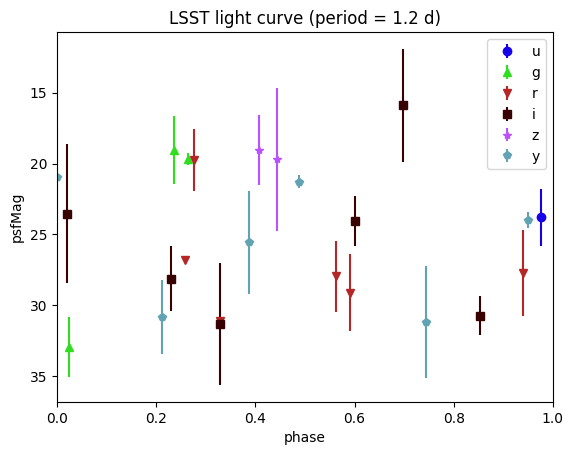
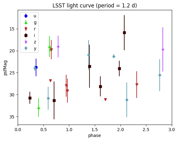
Phase-folded light curves
Our example light curves are not pretty, but we can show them phase-folded by simply providing a period argument, in days. This will fold the light curve according to the provided period, and the x-axis reflects the phase in the period.
[6]:
plot_light_curve(dia_object.iloc[0]["diaSource"], period=1.2)
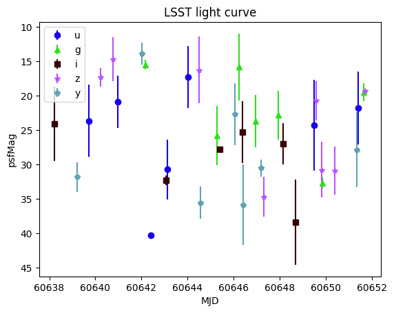
[7]:
plot_light_curve(dia_object.iloc[0]["diaSource"], period=1.2, num_periods=3, period_mjd0=60640.4)
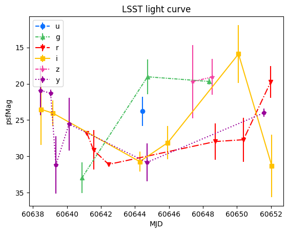
Incomplete band data
If you are missing data in one or more bands, those will not appear in the legend. The following light curve doesn’t have any r-band observations.
[8]:
missing_r = dia_object.query("diaObjectId == 4670308463850921897")
plot_light_curve(missing_r.iloc[0]["diaObjectForcedSource"])
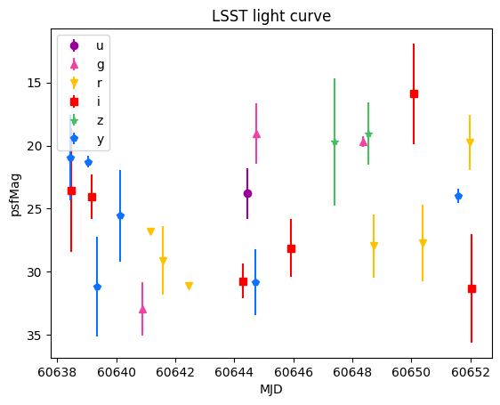
Customizing appearance
While we use the default Rubin color-blind friendly palatte, that might not work for you for whatever reason. For visual aspects of the plot that will vary by band, you can pass in a dictionary that maps the band string to the desired value.
filter_colorsfilter_symbolsfilter_linestyles
The first example uses a built-in color palatte, while the second example defines a new map.
[9]:
from lsdb_rubin.plot_light_curve import (
    plot_filter_colors_rainbow,
    plot_linestyles,
    plot_linestyles_none,
)

plot_light_curve(
    dia_object.iloc[0]["diaSource"],
    filter_colors=plot_filter_colors_rainbow,
    filter_linestyles=plot_linestyles,
)
[10]:
color_map = {
    "y": "#0c71ff",  # Blue
    "z": "#49be61",  # Green
    "i": "#ff0000",  # Red
    "r": "#ffc200",  # Orange/Yellow
    "g": "#f341a2",  # Pink/Magenta
    "u": "#990099",  # Purple
}
plot_light_curve(dia_object.iloc[0]["diaSource"], filter_colors=color_map)
You can also override a single value of the existing by-filter maps. In this case, we’re adding a line only in the r band.
[11]:
plot_light_curve(
    dia_object.iloc[0]["diaSource"],
    filter_linestyles=plot_linestyles_none | {"r": "--"},
)
About
Authors: Melissa DeLucchi
Last updated on: Aug 12, 2025
If you use lsdb for published research, please cite following the instructions here.